

Managing Image Color and Quality – Part two of two
The second part of this post on managing image color and quality focuses on the variables that are out of your control… and lucky you – under your printer’s control. I’ve tried to not get overly detailed about this technical stuff. There’s a line that we designers do not need to cross in our understanding of printing technology and I’ve tried to stay on the designer side. Having that said, I have never met a designer who was not interested in how graphic things work. And because of this experience and understanding of how designer’s minds work, I’ve included here the stuff that directly impacts you.
Things Your Printer Controls
Screening
This section assumes that your print provider is capable of AM and FM screening. (These two screening methods are defined in the following paragraph.) If your printer is not capable of both screening techniques or hybrid screening (which combines both on the same plate), and you are doing critical catalog, book, or annual report work, you need to find a printer that can handle those projects. This section also assumes that your printer’s prepress expertise allows her to adjust her plate curves for the substrate. (These are adjustments made in prepress to manipulate the halftone dot to create the optimum dot size for the job conditions.) These are not parameters you can send to your printer. Each pressroom adjusts its own settings, based on the equipment it has, to produce its best work. Between screening and other adjustments made in their prepress department, your printer makes sure that images print at the best possible representation of the file.
Conventional (AM) vs. Stochastic (FM) Screening Methods
In order to print an image via a printing press, of nearly any type, the image must be converted to a halftone; that is, the image must be made up of dots. There are two ways to convert the image to dots, and they are both referred to as “screening.” The older and more common method is conventional or AM screening. Conventional screening puts the dots in fixed rows, varies the size (Amplitude Modulation) of each dot, and places each ink color at a different angle. The second method is FM screening, and it scatters the dots at variable distances (Frequency Modulation). In FM screening (also called stochastic), the dots are a fixed size, but they are microdots (microdots are called spots). The two forms of FM screening include first order and second order. Stochastic is an example of first order FM screening, wherein the dot size is fixed and the frequency is variable. Second order FM screening allows for altering the dot size in areas where there is high density. Staccato (a Kodak product) is an example of second order FM screening.

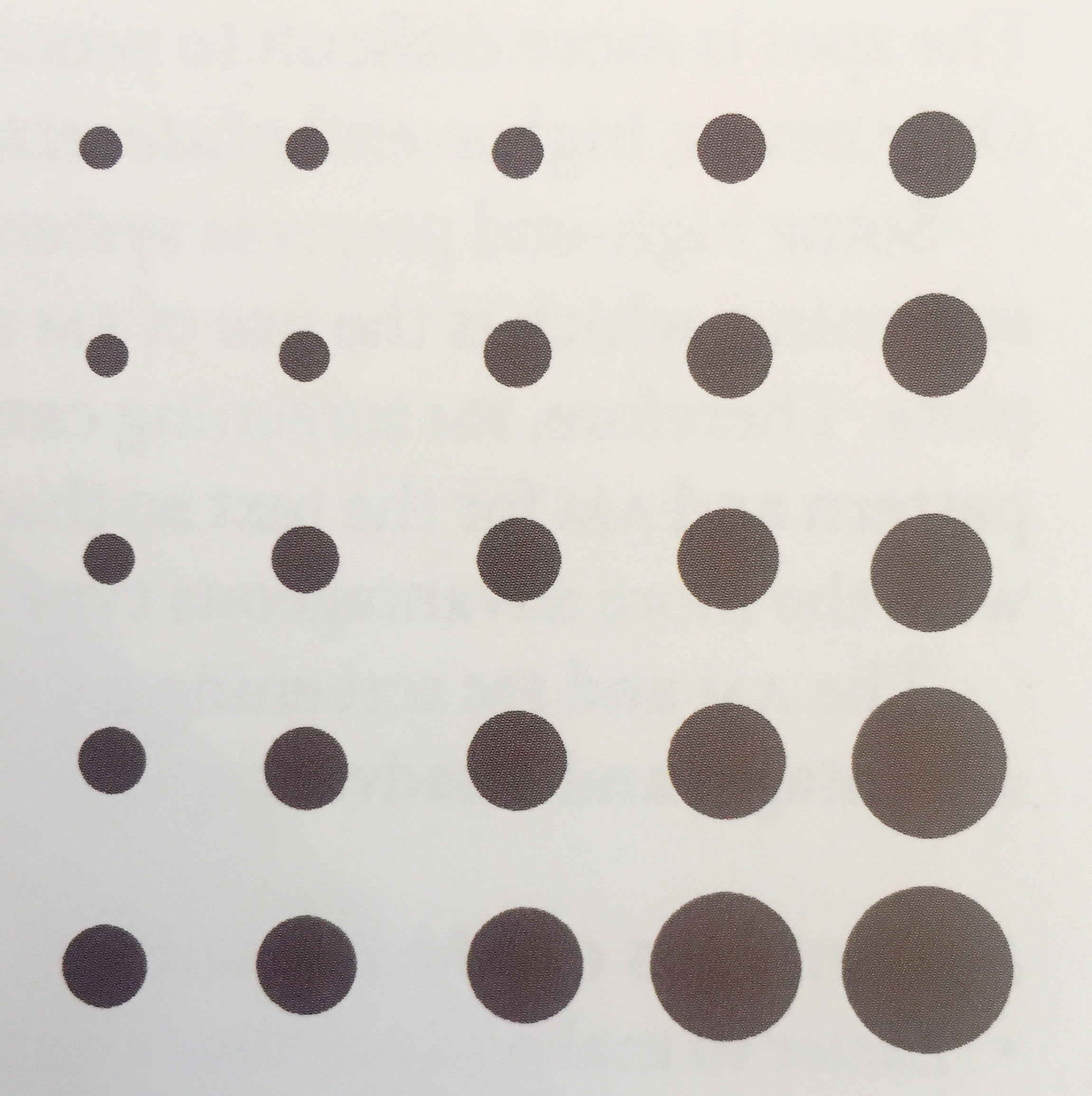
AM screening varies the size of the dot while
keeping the distance fixed.

FM screening varies the distance between
spots and the size is fixed.

Second-order FM screening varies the size and
distance between spots.
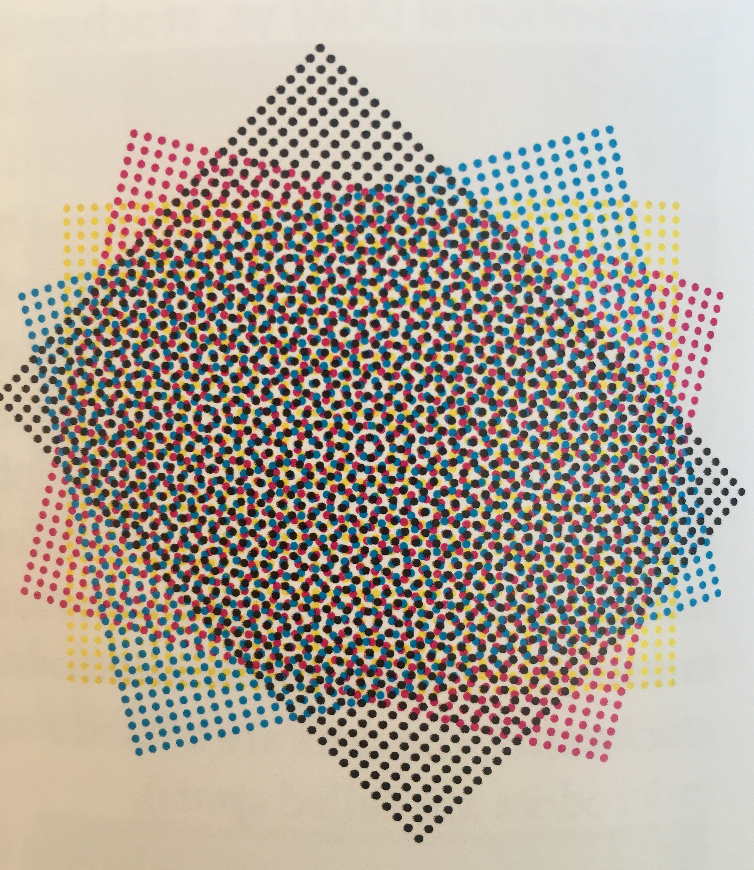
Your print provider can also vary the type of dot used; in addition to round dots, there are elliptical, diamond, linear, and square dots. A dot that is not round may be used to fine tune an image such as a photograph due to the effect the dot has on very small gradations. Your printer will choose the type of rosette and dot shape that is best for your job. It will depend on the paper, line frequency, type of press, and the characteristics of the images in the printed piece.
Whether your project is being screened with AM or FM, your printer will manage dot gain by adjusting the image in prepress for the type of paper you are printing on. Printers store characteristics for paper types and specific brands and finishes so that they do not have to re-key the information for each print job. When printing images with geometric patterns, such as fabrics with linear textures or repeating geometric backgrounds, all fm screening is superior. It’s random dot placement eliminates the interference that conventional screening produces when the angle of a line of dots intersects with the angle of a design element. This phenomenon is called a moiré, and it produces an undesirable ripple-like effect in the image.
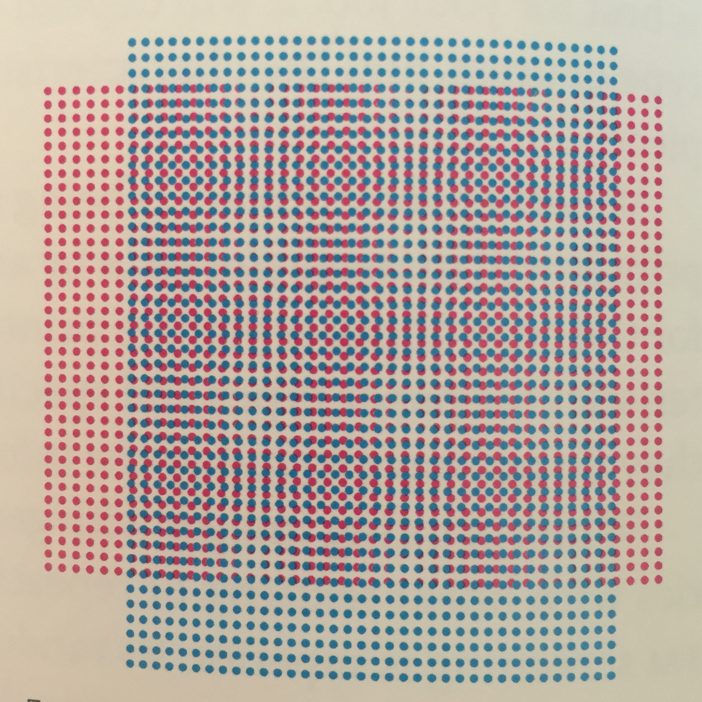
Screen angles placed to produce a moiré

Conventional screen angles for CMYK and the resulting “rosette”.
Although nearly every digital prepress system is capable of producing stochastic screening, its adoption has lagged behind conventional screening because of the spot/microdot it generates. The spot is more difficult to proof and image on a printing plate. Only newer, higher-end platesetters can image a microdot. Some high-end prepress systems are able to generate hybrid screening, which is the use of FM and AM screening on the same plate. Therefore, FM screening can be used for a difficult fabric pattern and AM for the text so that each image type is reproduced with the more advantageous type of screening. The AM and FM screening methods each have their own advantages and disadvantages.
Advantages of AM Screening
• Easier to make adjustments on press
• Clean, perfect screen tints
Disadvantages of AM Screening
• Patterns can cause moiré in screening.
• The background/paper color shows through more, which affects the overall color more than with FM screening.
Advantages of FM Screening
• FM is better for touch plates printing together with AM CMYK (as in Hi-Fidelity printing)
• FM is more forgiving of mis-registration, which is an advantage when printing across the grain and dealing with paper stretch.
• Larger CMYK gamut may be possible depending on paper choice
• Better reproduction of geometric patterns
• Less dot gain with the microdot of stochastic/FM screening.
Disadvantages of FM Screening
• First order FM screening does not store the ripped file for repeatability.
• Tints are not as smooth as in AM.
• Making moves on press may require new plates (due to less range of movement on press,) which is expensive and time-consuming.
• Small plate imperfections cannot be manually touched up and require a new plate be made.
• Unexpected color shifts can occur in tints of spot colors.
Ink substitution and touch plates
There are ways to work around CMYK being a smaller gamut than RGB. One method is with ink substitution. This keeps a job on a 4-color press, and it works if one color or range of colors is not in the desired gamut. For example, if purple is a dominant color and there are no skin tones or other critical color areas to worry about, rhodamine red or another spot red can be substituted for magenta. Or a fluorescent yellow substituting for process yellow is another example of how you might obtain the results you want. This is not a very scientific process. You need to rely on experienced print professionals whose color sensitivity borders on the paranormal. Many of these people have been in pressrooms and prepress departments for decades and have honed their color sensing skills into a supernatural ability.
Another method of increasing CMYK’s gamut for better color reproduction is Hexachrome printing. Hex is a different prepress workflow that separates and screens the file for the six Hex print colors: Hexachrome Yellow, Hexachrome Orange, Hexachrome Magenta, Hexachrome Cyan, Hexachrome Green, and Hexachrome Black. These are not the regular process colors plus orange and green. These colors are more intense
and designed specifically for high-fidelity color reproduction. Creating a touch plate in your Photoshop file for Hexachrome
Green will not work. The true Hexachrome colors are produced in a Raster Image Processor (RIP) with specialized software for
ripping the six plates necessary at the proper screen angles.
Touch plates are additional plates that are added on additional ink units, requiring a 5 or more color press. Color experts analyze images that are out of gamut and figure out how and where to add a touch plate and also the ink color(s) that will be used. Common touch plate colors are true red, bright green, orange and flourescent colors, colors that are impossible to achieve with CMYK.
Under Color Removal (UCR)
UCR is a method of reducing ink density in areas that have dense, dark colors. Too much ink on the printing sheet can result in a mottling of shadow areas and a loss of detail. UCR is normally done in prepress software. UCR is used to remove density in areas where too much ink would be applied. For example, a “non-standard” rich black of 100% black and 50% each of magenta, yellow, and cyan will result in a screen build of 250%. Adding the percentage of each ink together gives you the total amount of ink you are laying down. A DMAXof 250% is a bit much; 240% is the maximum DMAX (maximum density) recommended for most uncoated paper. (Each printing company sets its own DMAX level depending on its equipment.) In this case, your printer’s prepress department may adjust those percentages by deploying UCR whether those percentages are in an image or in a specified CMYK ink recipe in a program like InDesign.
Gray Component Replacement (GCR)
When there are several inks mixing in the shadow area of an image, sometimes they just muddy up to gray. Substituting a little bit of black ink will create a crisper, deeper, shadow with more detail. In this case, the prepress gurus will identify areas where GCR will help. I do not believe that is standard operating procedure in every print shop, though. For example, don’t expect this service on your brochure for the local Certified Public Accountant with the group picture taken at last year’s holiday party. However, expect it on a coffee table book or a high-end catalog.
Repeatability
Now that run lengths are getting shorter and far more digital repurposing of imagery and branding elements exists, matching printed material from run to run and project to project is critical. You want to be able to print 50,000 brochures for your client and repeat that print run six months later with hardly any visible shift in the color. Second-order FM screening can store job information down to the dot, as can AM screening.
I would love to know how you felt about this topic. Was this too technical? Not technical enough? Do you have any questions about this or would you like me to further explain something? Do you have a request for a topic for me to cover or elaborate on? I’d love to know, comment or email me at marina @ designingforprint.com
(all illustrations © 2017 “Designing for Print”)


